Data Interpretation Questions Practice Question and Answer
8 Q:The following table shows the number of units of product produced and sold by a company over the course of six years.
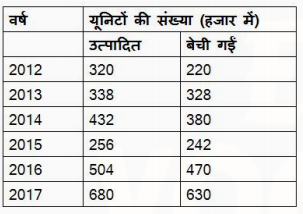
Find the ratio between the total number of units sold in 2013 and 2015 and the number of units produced in 2015 and 2016?
831 0602e0668a503a25a4b89f1ae
602e0668a503a25a4b89f1ae- 114 : 19false
- 229 : 38false
- 33 : 4true
- 47 : 9false
- Show Answer
- Workspace
- SingleChoice
Answer : 3. "3 : 4"
Q:Directions: The line graph shows the number of work visas issued by a country in each year from 2011 to 2016. Study the diagram and answer the following questions .
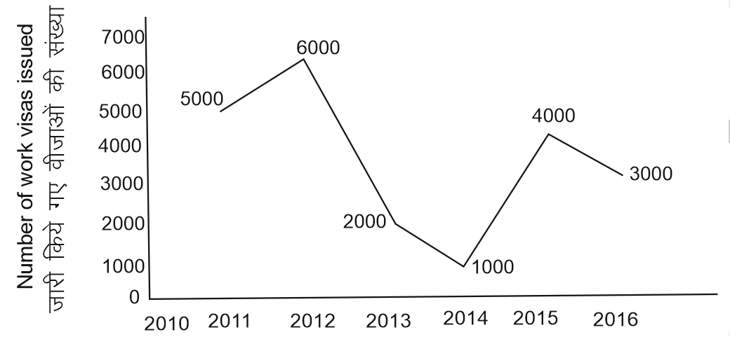
What is the total number of visas issued from 2012 to 2015 ?
828 05ed9ef8be11a1c4b43e6e3b0
5ed9ef8be11a1c4b43e6e3b0- 113000true
- 218000false
- 316000false
- 47000false
- Show Answer
- Workspace
- SingleChoice
Answer : 1. "13000 "
Q:Direction: Study the pie chart carefully and answer the given questions. The pie chart shows the percentage breakup of students in different classes from VI to X in the year 2017
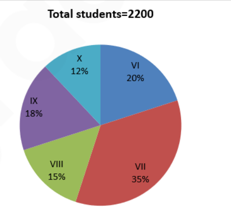
If in 2018, the total number of students in class VI and class VII is increased by 10% each and the total number of students in class VIII is decreased by 20% then what is the difference between the total number of students in class VI and VII together in 2018 to that of the total number of students in class VIII in 2018?
825 060a257bcde4c2e1331dbeaa4
60a257bcde4c2e1331dbeaa4- 11078false
- 2878false
- 3976false
- 41067true
- 51156false
- Show Answer
- Workspace
- SingleChoice
Answer : 4. "1067"
Q:Direction: The bar graph shows revenues in rupees lakhs from selling four different products (A, B, C and D) by a certain company. Study the diagram and answer the following questions.
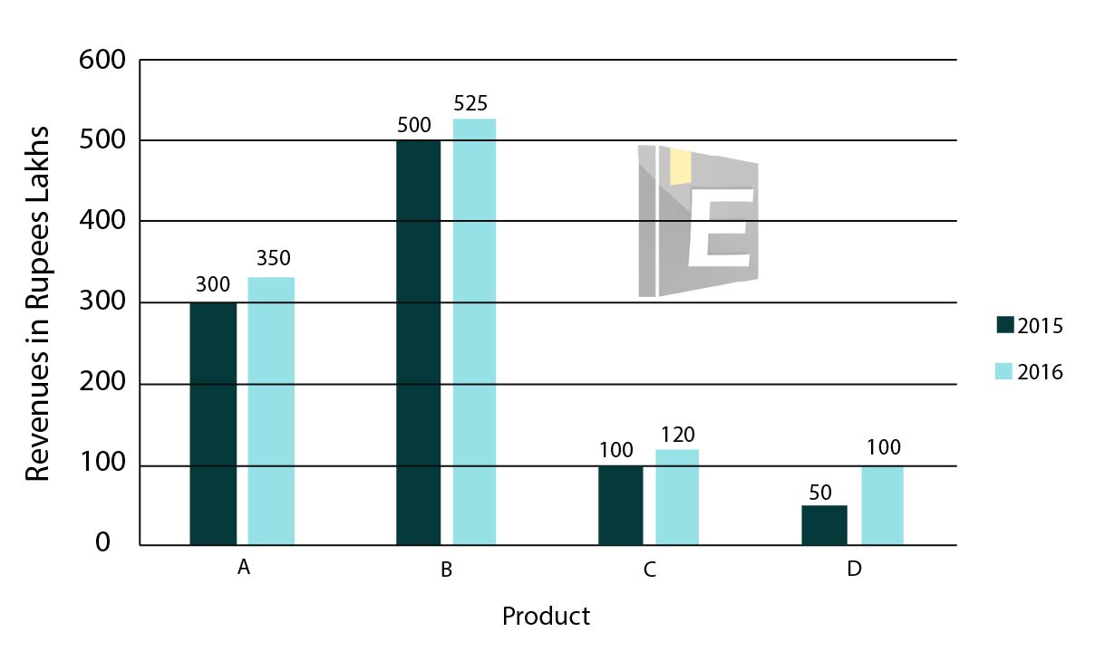
Revenues from which product were the least in both the years 2015 and 2016?
824 0619f627bc1c85f0fbf506cd9
619f627bc1c85f0fbf506cd9- 1Afalse
- 2Bfalse
- 3Cfalse
- 4Dtrue
- Show Answer
- Workspace
- SingleChoice
Answer : 4. "D"
Q:Directions : A graph showing the price of rice in India during the year 2000 to 2003 is given below. Study the graph carefully and answer the questions.

The range of price for a year is the difference between the maximum and the minimum prices for that year. The graph shows that this range of price was the greatest for the year
823 06391d7ab58400a550dd8e020
6391d7ab58400a550dd8e020- 12000true
- 22001false
- 32002false
- 42003false
- Show Answer
- Workspace
- SingleChoice
Answer : 1. "2000 "
Q:The following chart depicts the percentage of Educated and Uneducated men and women in a city with a population of 2,50,000.
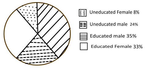
How many of these women are Uneducated?
823 05f9f9c064a02db7b99b229e3
5f9f9c064a02db7b99b229e3- 120,000true
- 235,000false
- 340,000false
- 425,000false
- Show Answer
- Workspace
- SingleChoice
Answer : 1. "20,000"
Q:Direction: Study the pie chart carefully and answer the given questions. The pie chart shows the percentage breakup of students in different classes from VI to X in the year 2017
If the total number of boys in class VIII is “x” and the total number of boys in class IX is “x+40”. The total number of girls in class VIII and class IX together is 306. Then find the value of “x”.
822 060a25856de4c2e1331dbead3
60a25856de4c2e1331dbead3- 1184false
- 2196false
- 3190true
- 4210false
- 5174false
- Show Answer
- Workspace
- SingleChoice
Answer : 3. "190"
Q:Direction : The table given below represents number of bikes of five different brands sold from 2001- 2005, with the help of data given in the table, answer the following questions.
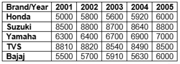
The sales of Yamaha increased from 2001 to 2005 by what percentage?
821 060a4eed6b33a50608a41f7f0
60a4eed6b33a50608a41f7f0- 113.33%false
- 210.6%false
- 311.11%true
- 412%false
- 5None of thesefalse
- Show Answer
- Workspace
- SingleChoice